THE EXTENSION
Daniel Libeskind's modern extension to the historic building. The Museum Store is located inside.
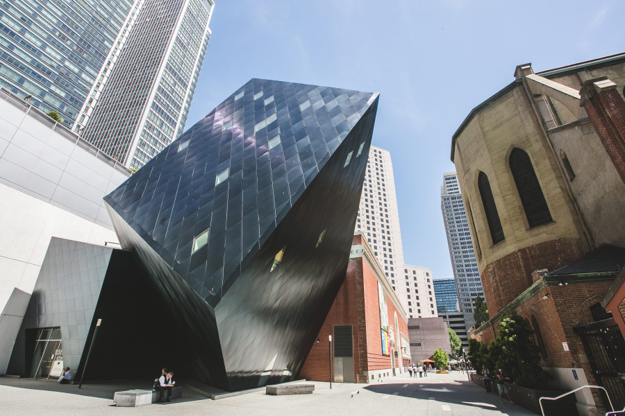
In 1994, the San Francisco Redevelopment Agency invited The Contemporary Jewish Museum to develop the historic Jessie Street Pacific Gas & Electric (PG&E) Power Substation, a 1907 landmark designed by architect Willis Polk. The CJM selected architect Daniel Libeskind in 1998 to design its new home, an adaptive reuse of the substation. In the design for The Contemporary Jewish Museum, his first commissioned project in North America, Libeskind responded to The Museum's mission to be a lively center that fosters community among people of diverse backgrounds through shared experiences with the arts by focusing on the celebratory nature of the Jewish experience.
The Contemporary Jewish Museum's building embodies a number of symbolic references to Jewish concepts. Most notably, architect Daniel Libeskind was inspired by the Hebrew phrase L'Chaim (To Life), because of its connection to the role the substation played in restoring energy to the city after the 1906 earthquake and The Museum's mission to be a lively center for engaging audiences with Jewish culture.
Daniel Libeskind's modern extension to the historic building. The Museum Store is located inside.
To extend the old Jessie Street Power Substation beyond its original walls, Libeskind created a design based on the two Hebrew letters that spell the word chai (life), the chet and the yud. From the outside, the extension is most remarkable for its unique shape, as well as its skin: a vibrant blue metallic steel consisting of over 3,000 luminous blue steel panels, which change color depending on the time of day, weather, or one's vantage point, creating a dynamic, “living” surface. Several theories abound about why blue was chosen, but Libeskind leaves it open to interpretation. Some think that blue was chosen because it connects to the idea of life, water as a life source, and is often a color associated with Judaism.
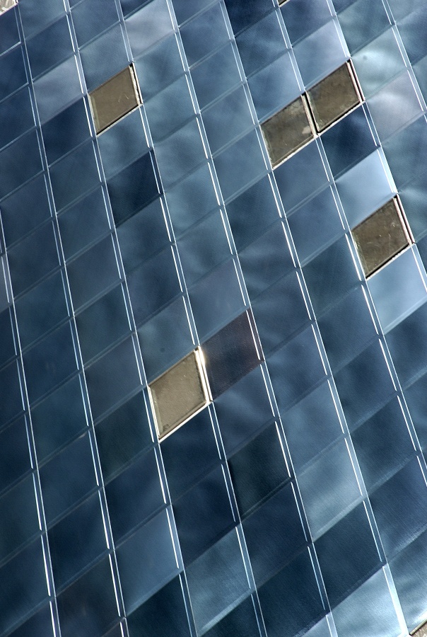
The blue steel "skin" of the modern extension.
The blue color of the steel is achieved through a procedure called interference-coating. The steel was treated with a chemical bath to create a blue color and will not fade. This process involves shooting electricity through the steel and giving it a bath of a certain chemical mix, which causes the stainless steel to oxidize. Since there are no dyes or pigments to decay, the color will never fade or chalk. The CJM building was the first to feature this unique cross-hatching surface finish, which helps to diffuse and soften the reflection of light off the blue stainless steel.
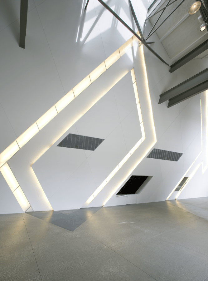
The Pardes Wall, in the Koret Taube Grand Lobby.
In dialogue with the historic structure, a striking new form greets visitors upon their entrance from Jessie Square and serves as a dynamic entry to The Museum. Spanning the length of the Koret Taube Grand Lobby's 2,500-square-foot public space is the PaRDeS wall, an architectural installation incorporating an abstract representation of the Hebrew acronym PRDS. The word PaRDes means “orchard,” but is also an acronym referring to four distinct levels for interpreting traditional Jewish texts: literal, hinted, allegorical, and mystical.
Each of the four letters of the acronym is embedded into the wall and illuminated, creating a visually dynamic atmosphere that evokes The Museum’s philosophy of embracing multiple interpretations and layers of meaning.
Additionally, the word Pardes comes from the same root as "Paradise."
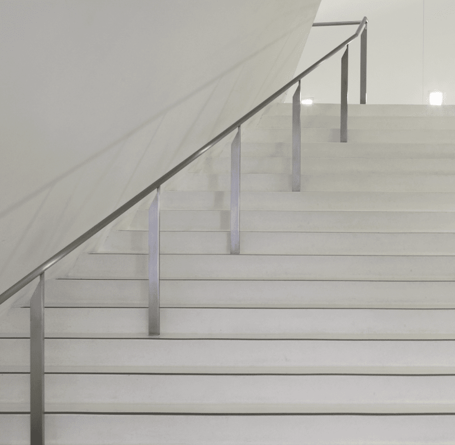
The 18 stairs on the grand staircase leading up to the second floor.
Libeskind created 18 stairs, leading up from the first level, which get smaller as they rise. At the top of the stairs is an overlook from which a visitor can see all the wings of The Museum. In Hebrew, each letter represents a number. The numer 18 is often associated with luck and prosperity as it is the numeric equivalent to the Hebrew word for life, chai. Libeskind utilized the number 18 a few times in The Museum’s architecture, tying the design to the embodiment of the Hebrew word for life.
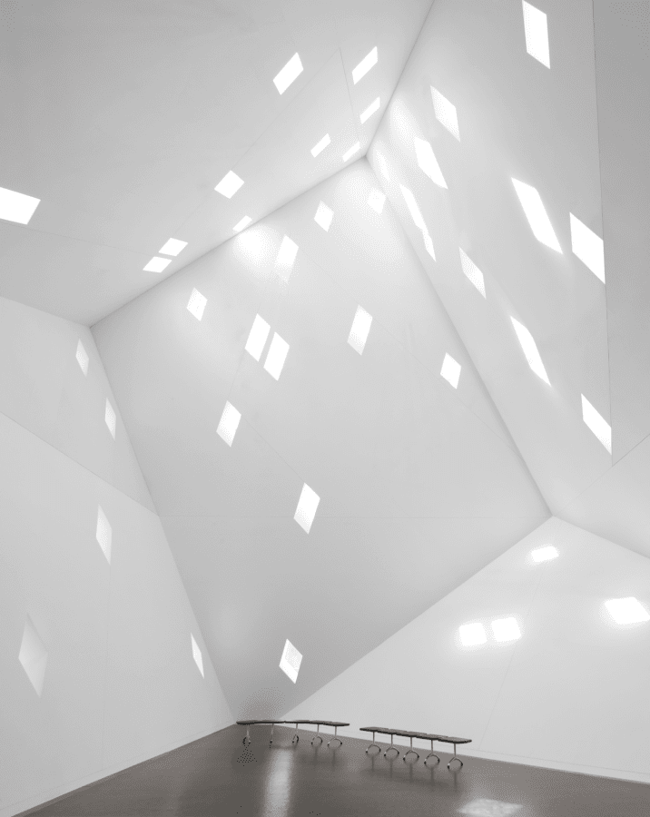
The 36 windows of the Stephen and Maribelle Leavitt Yud Gallery.
The second floor’s west end culminates in the dramatic 2,200-square-foot Stephen and Maribelle Leavitt Yud Gallery reaching at its peak some 65 feet high, symbolically representing the Hebrew letter yud. This floating gallery mimics the form of the yud, the only Hebrew letter that floats above the line. This mystical letter begins the Hebrew words for Jew, God, (or G-d) and Jerusalem, and is the second letter in the word chai for life. The ascending, dynamic movement up to the light-filled yud shape creates a compelling space for experiencing performances and artist installations.
There are 36 diamond shaped windows in the Yud Gallery; 36 equals twice eighteen or double chai. In Jewish culture, multiples of 18 are considered good luck. There is also a mystical belief that in every generation there are 36 hidden righteous people who receive the divine presence. They are called the lamed vovniks, meaning the 36ers in Yiddish. The multiple windows also symbolize multiple perspectives.
The Yud Gallery was not created for visual art; instead it was created as a gallery for audio installations and features, performances, and special events. The room is elevated by green design, which means that the gallery uses 50% natural light.
Photos by Gary Sexton Photography, Frances da Silva, and Paul Dyer.